UX/UI Design
Farmly Fresh’s mission is to connect people with goods and delicious recipes from local farms and chefs all at a great price.
By 2025, mobile shopping is predicted to account for 45% of all sales made outside of physical stores. My goal was to determine if a market exists for a new mobile-first grocery shopping app, while understanding what pain points users currently face when grocery shopping.
Click here for interactive prototype if you are using a mobile device
To understand the grocery store market better, I conducted a competitive analysis and domain research to understand the industry and identify market opportunities.
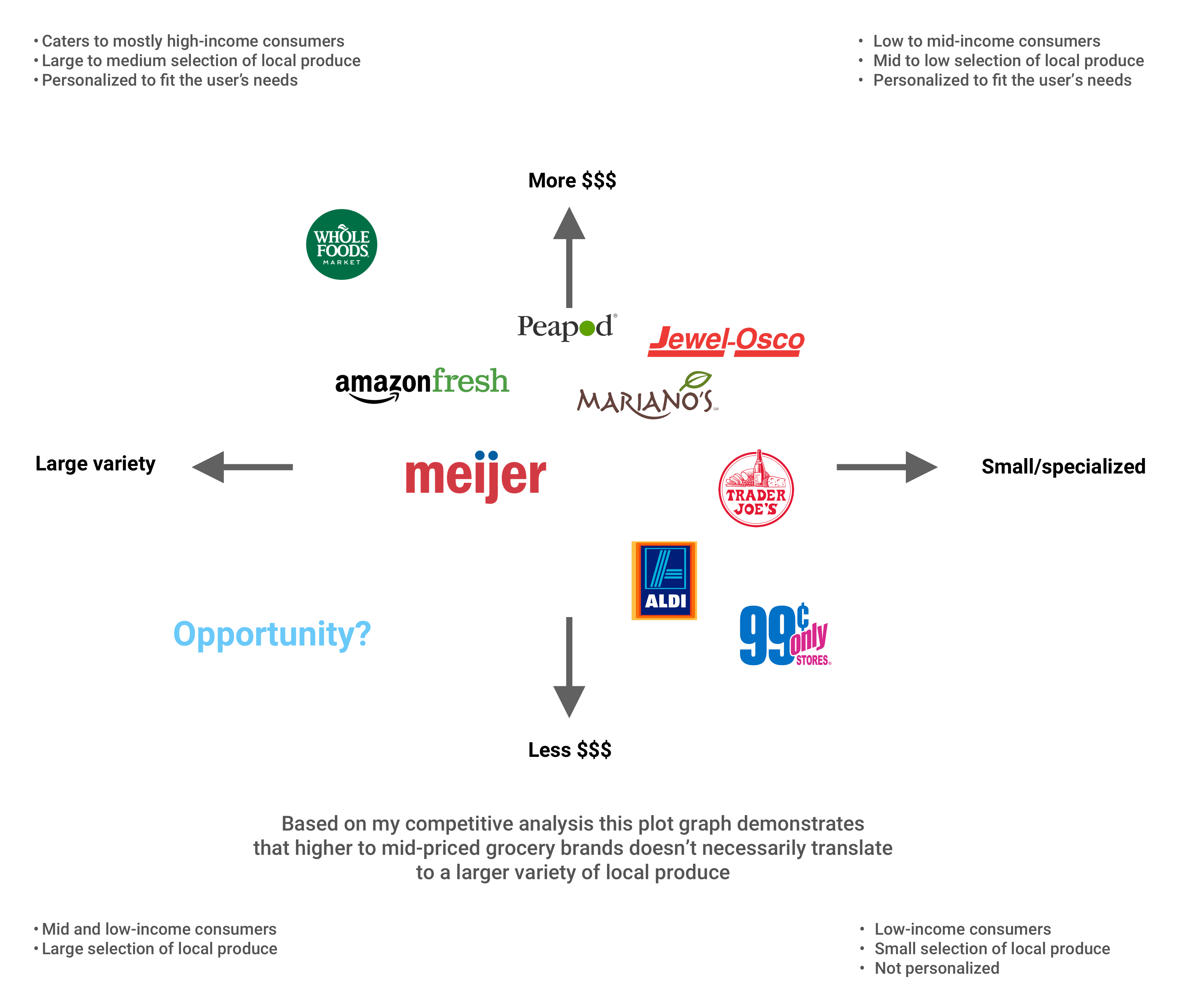
From the competitive analysis, I was able to analyze Farmly Fresh’s competitors' strengths and weaknesses. One of the key differences in competitors is whether the company has its own inventory of produce it delivers to the user or if it partners with local grocers to deliver produce to the user.
I also found out which audience each competitor catered to, and what their business and pricing models were so Farmly Fresh had a unique value proposition that stood out in this growing market.
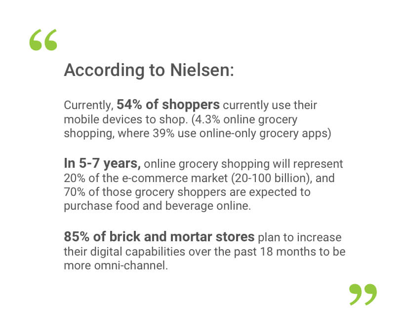
To back up these insights I did some domain research to understand the grocery sector.Through reading articles and watching webinars, I discovered what trends were emerging, what competitors were dominating the market, and how saturated was the market with grocery apps.
Here are some insights.
As I was doing market research, I also conducted user research with 6 users (age 24-37). My goals for these interviews was to understand:
• What influences users to shop at specific stores and buy a specific products.
• What were some of each user’s shopping behaviors.
• What are each user’s experience with using technology and grocery apps.
What I learned was each user had similar pain points, both online and in-person grocery shopping, but they were expressed in different in ways.
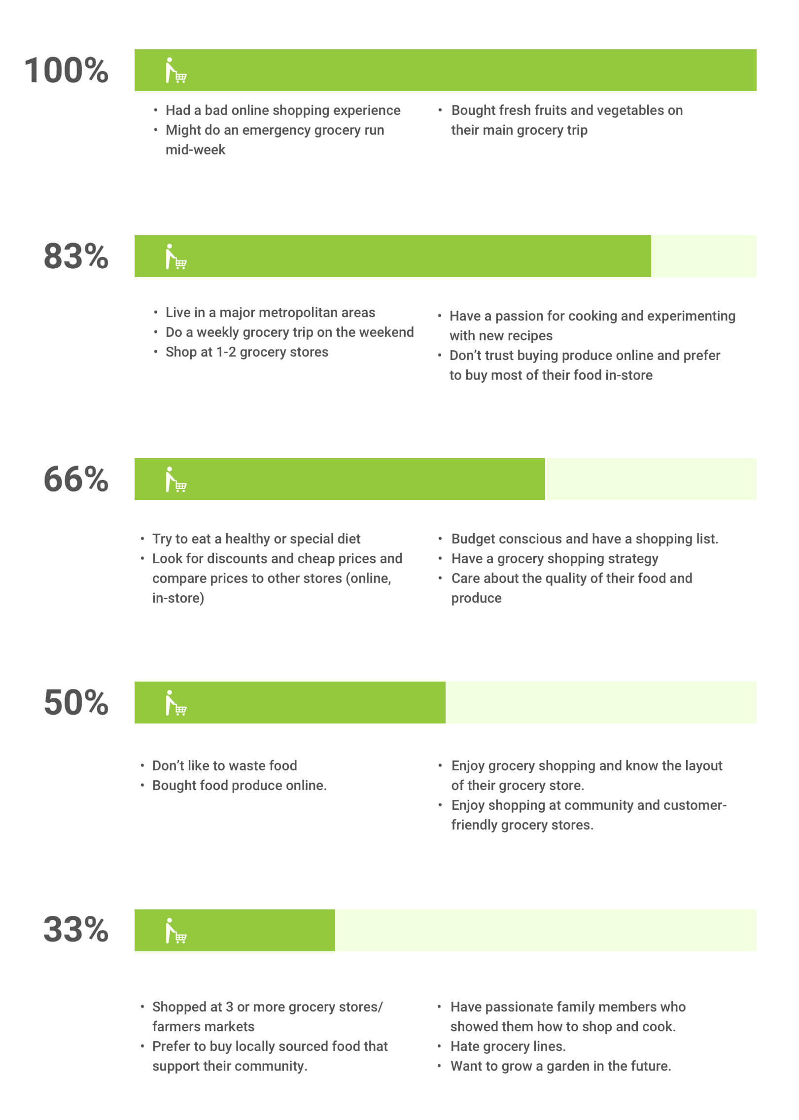
Deriving from the users interviews, I organized a list of common goals, behaviors, frustrations, motivations, and influences that overlapped between each user to define a problem statement that represents a Farmly Fresh user.
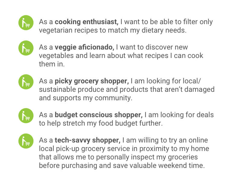
Five user stories were created to understand how users saw shopping at grocery store, and were Farmly Fresh could tap into each users’ desire to discover and buy produce quickly at an affordable price.
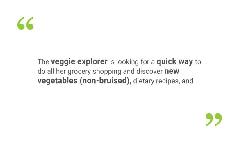
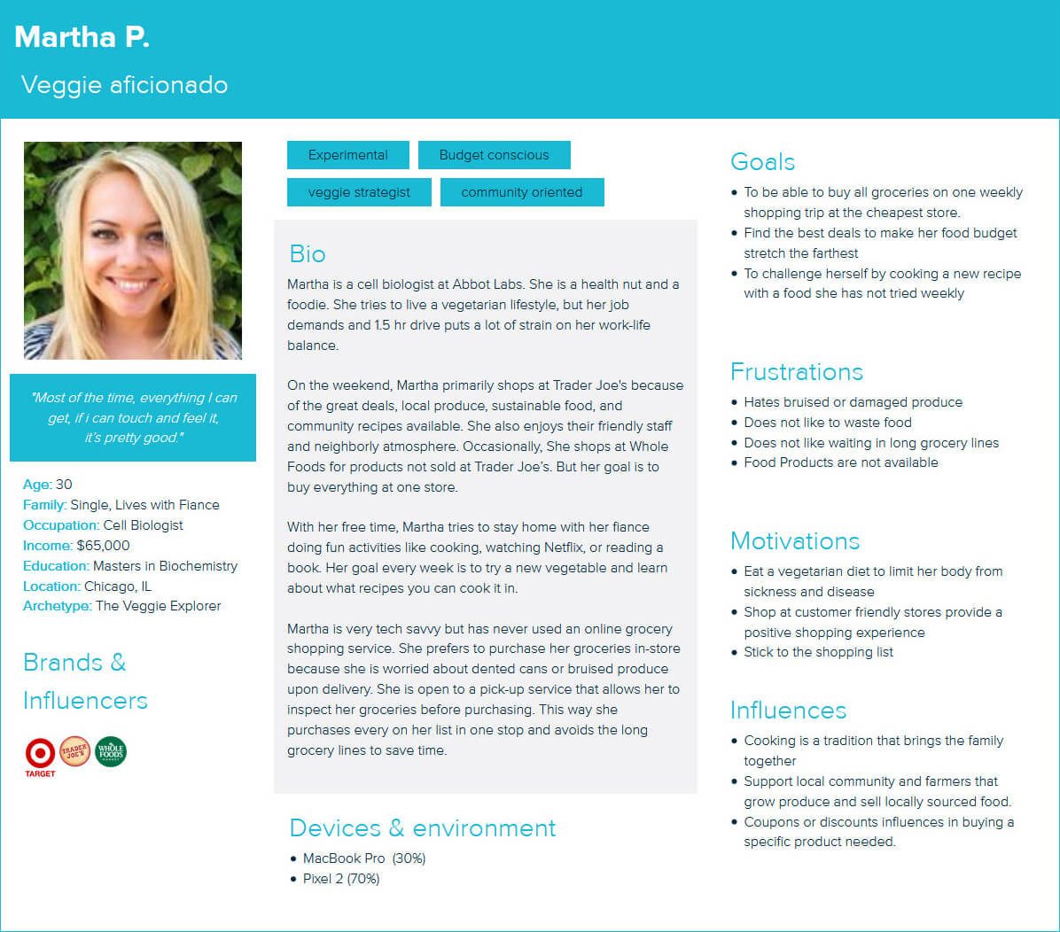
From these insights, I developed a user persona representing Farmly Fresh’s target audience.
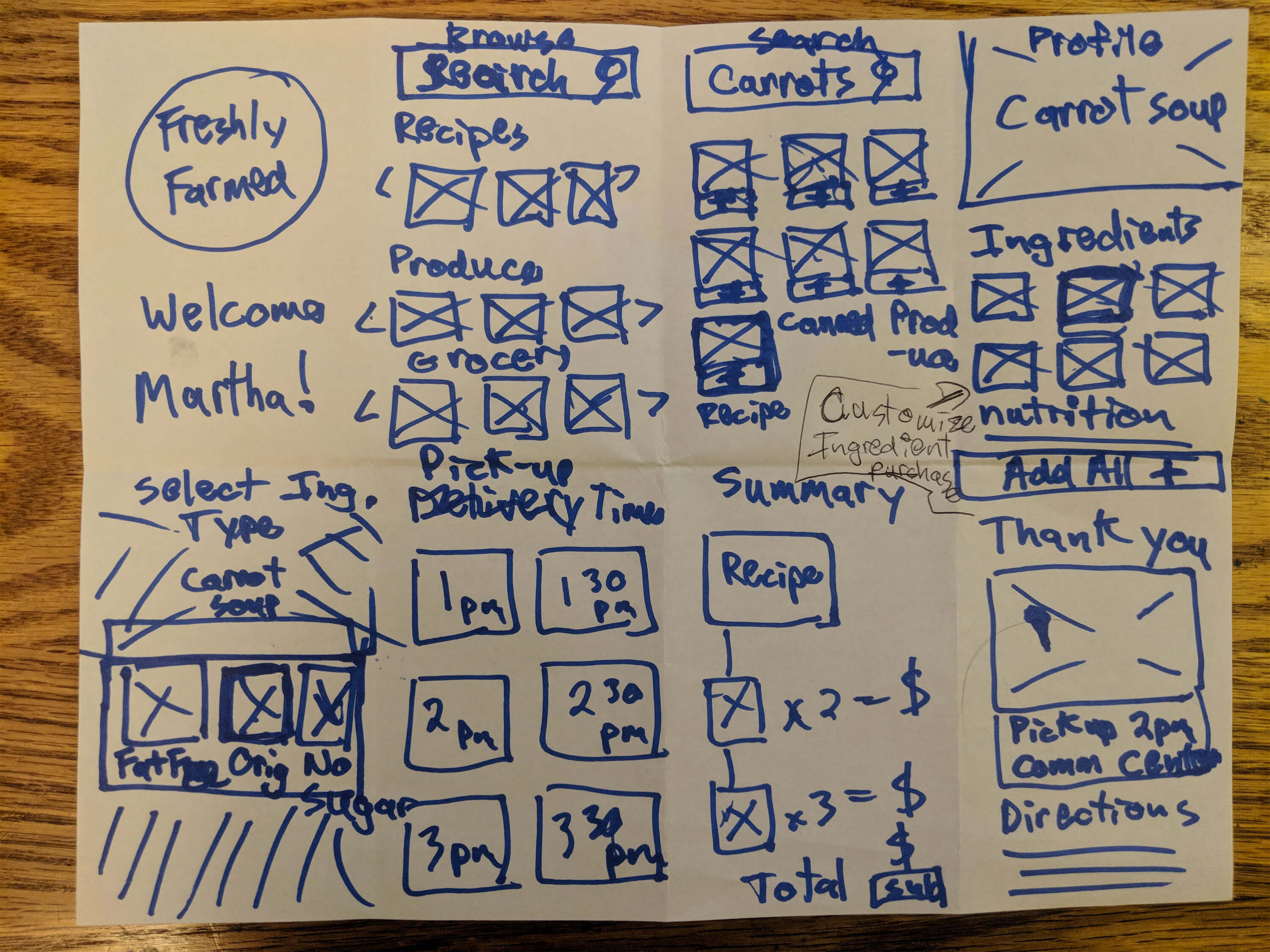
To understand how users shopped for groceries, I referenced several eCommerce sites and apps to see their step-by-step process from browsing and searching to checking out and receiving their products. From this, I created a rough task flow and concept sketches to brainstorm several ideas.
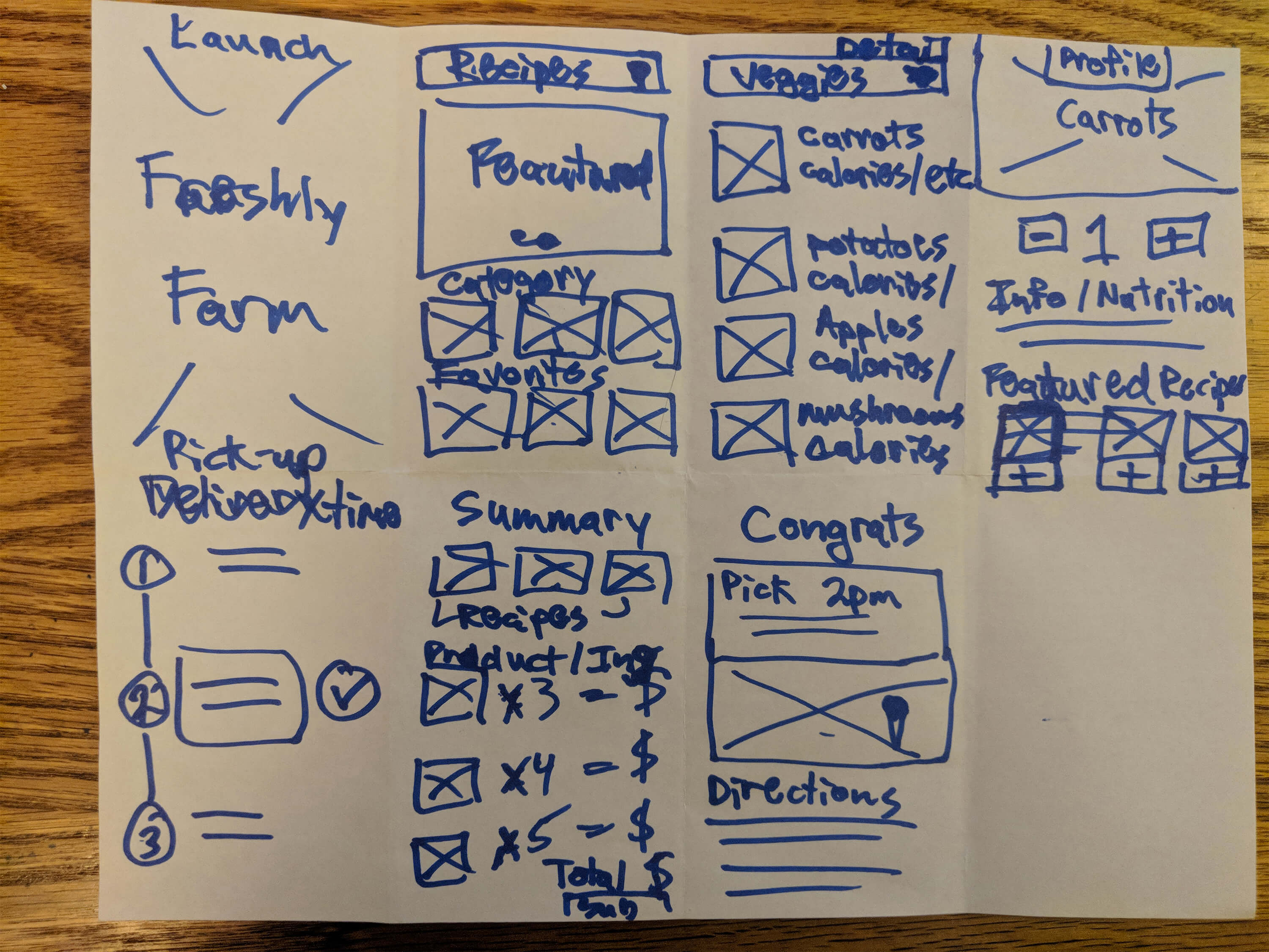
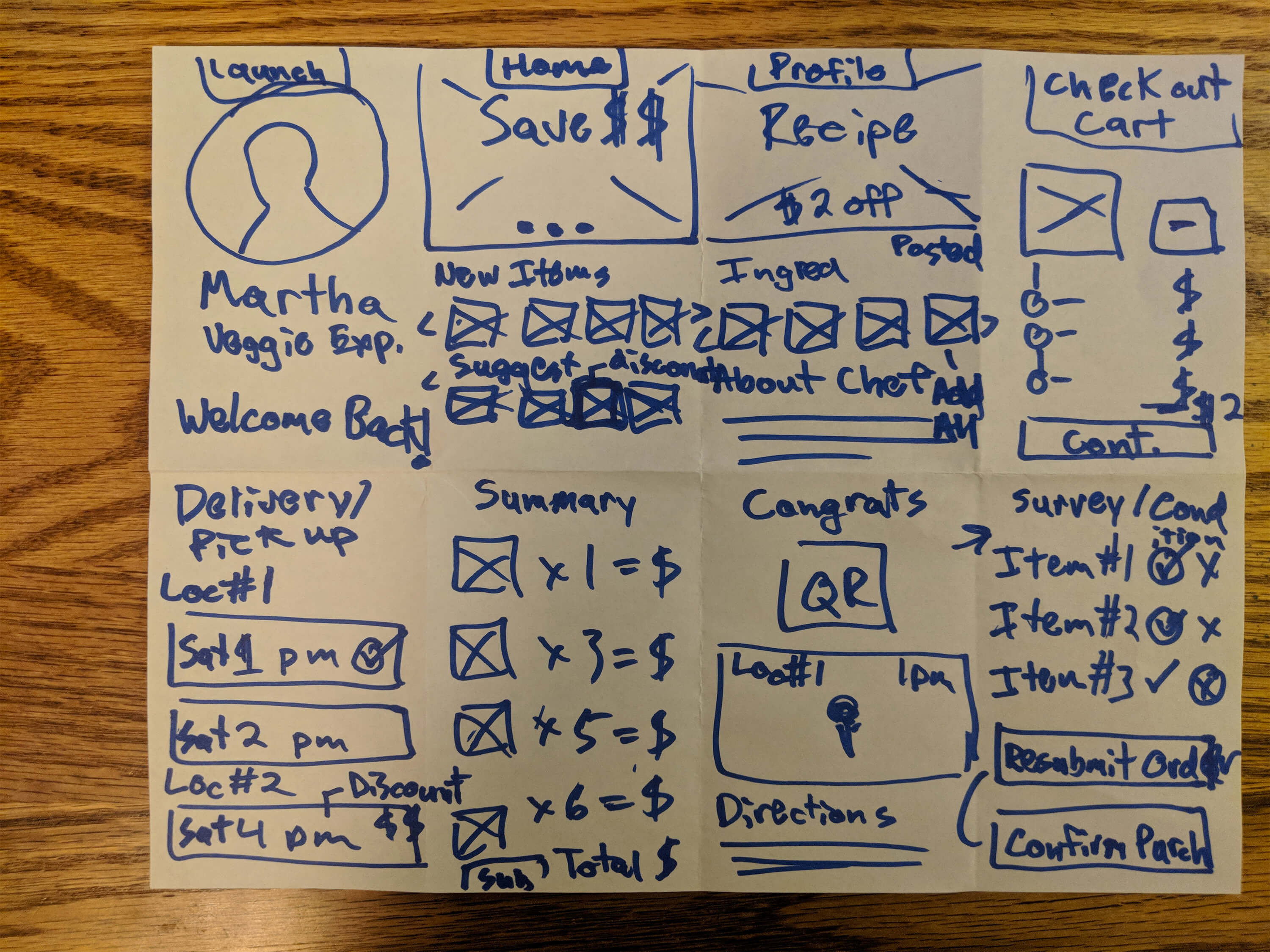
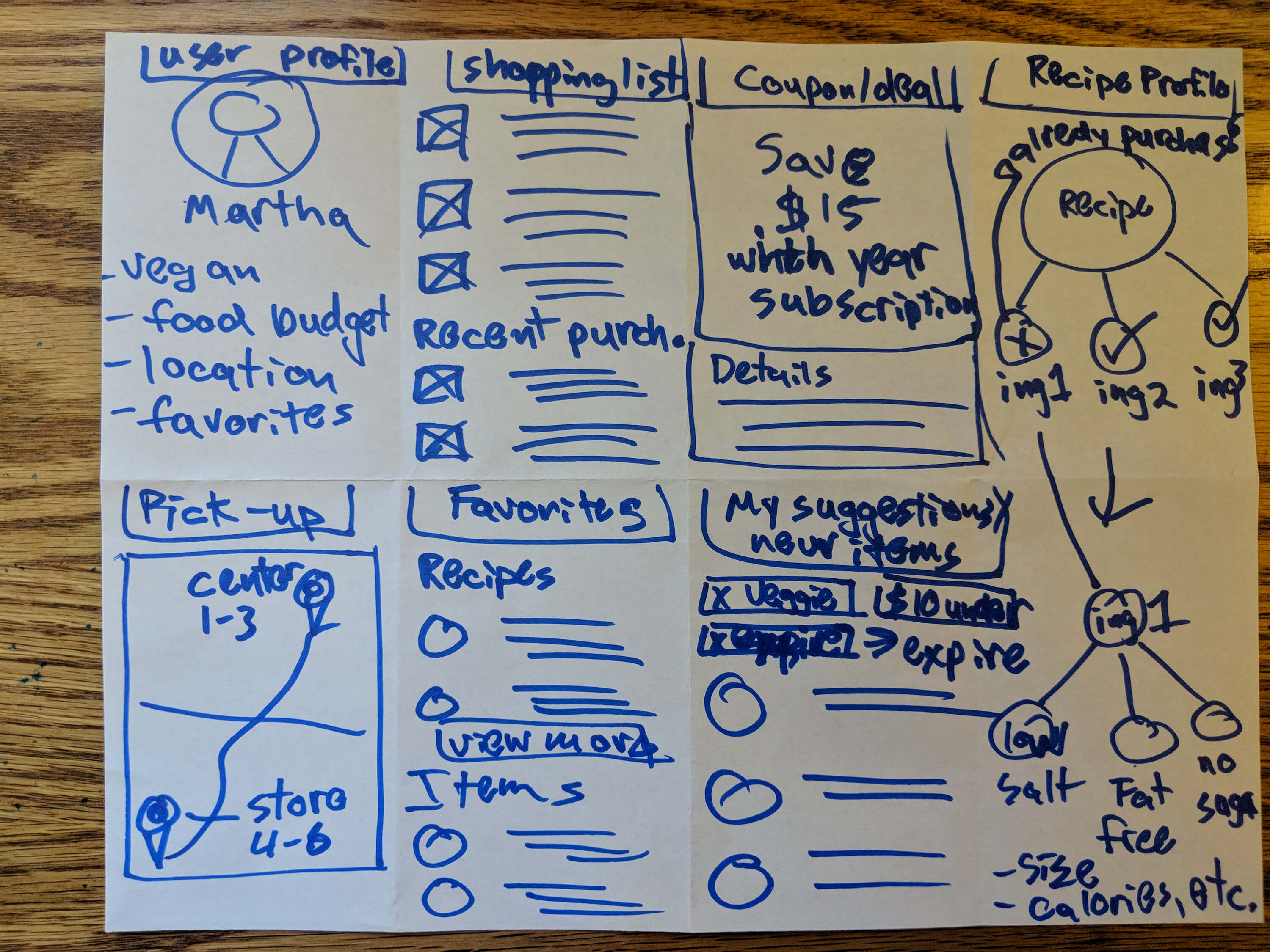
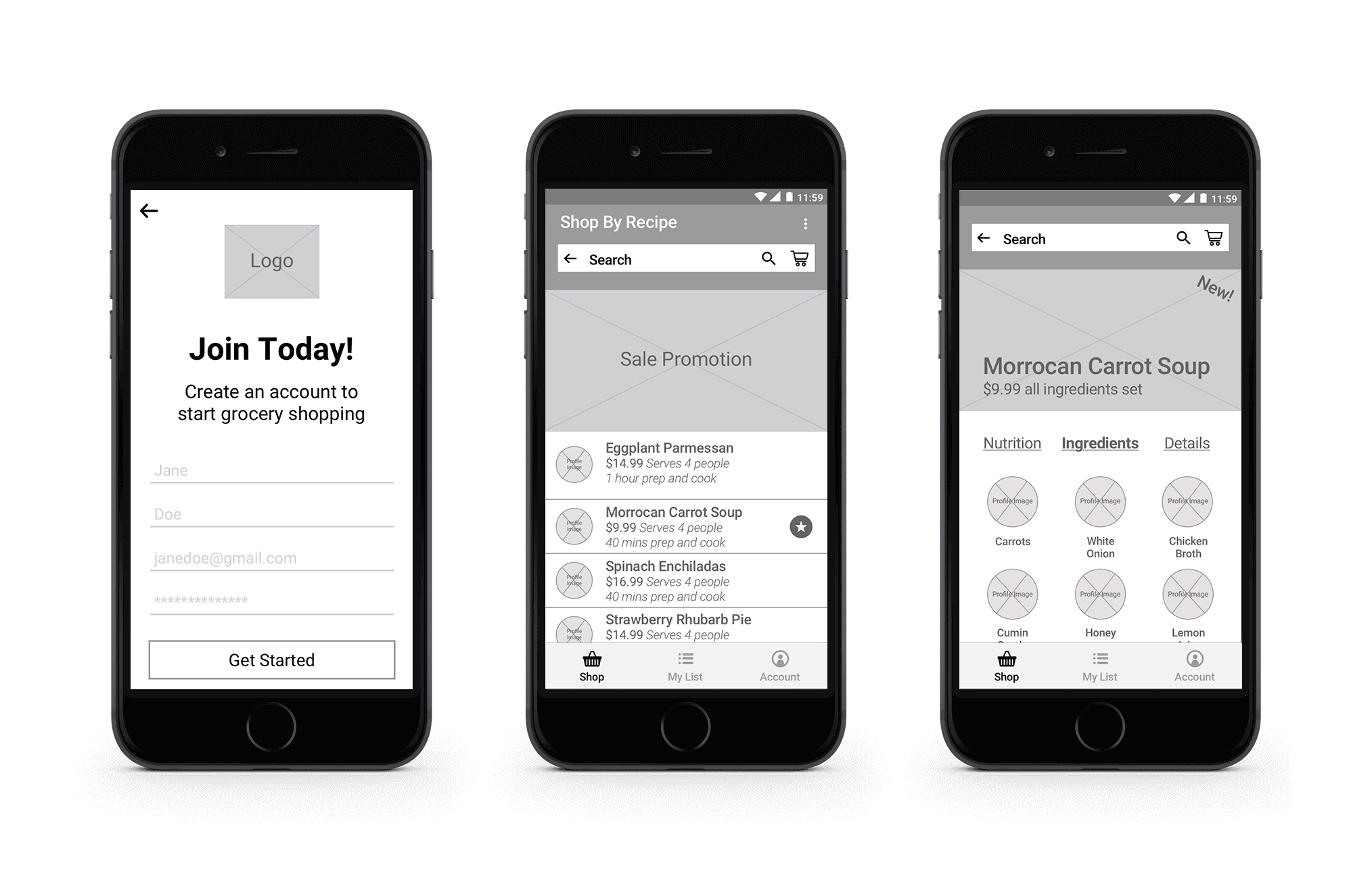
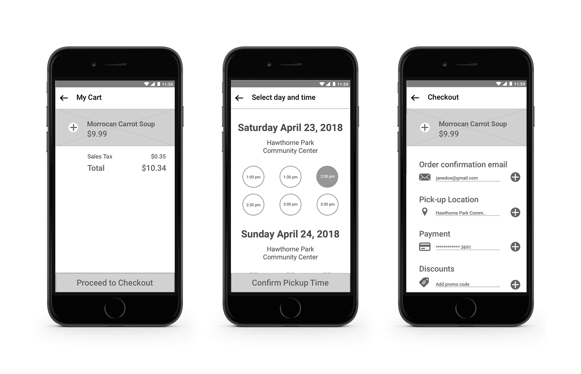
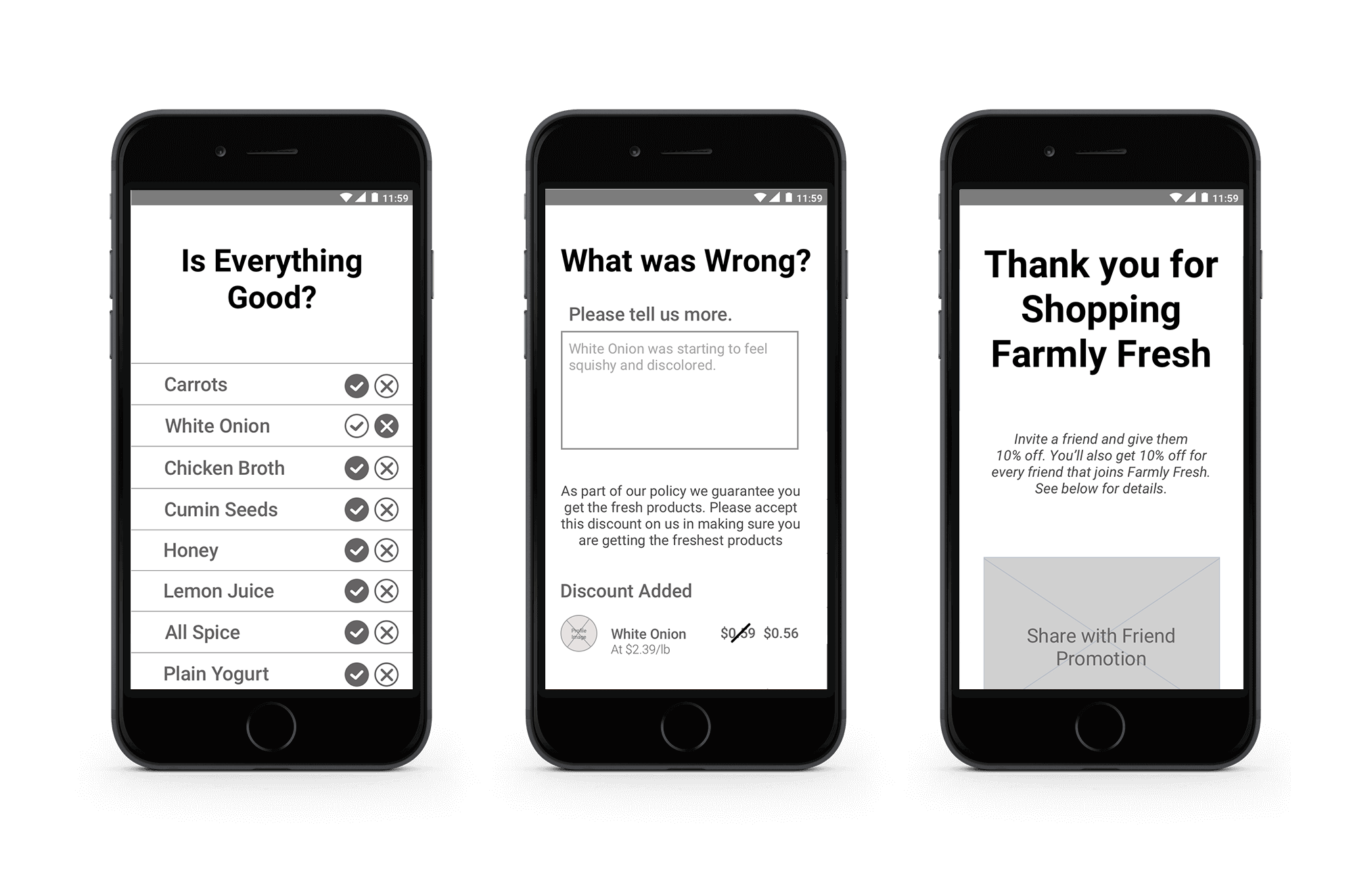
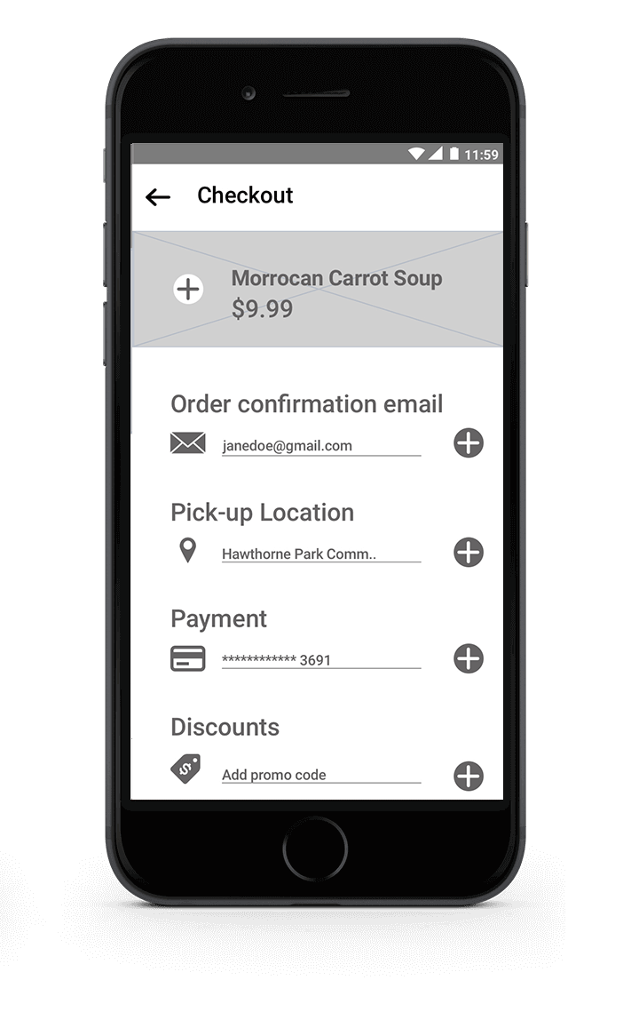
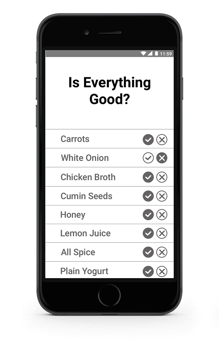
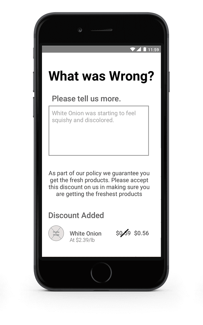
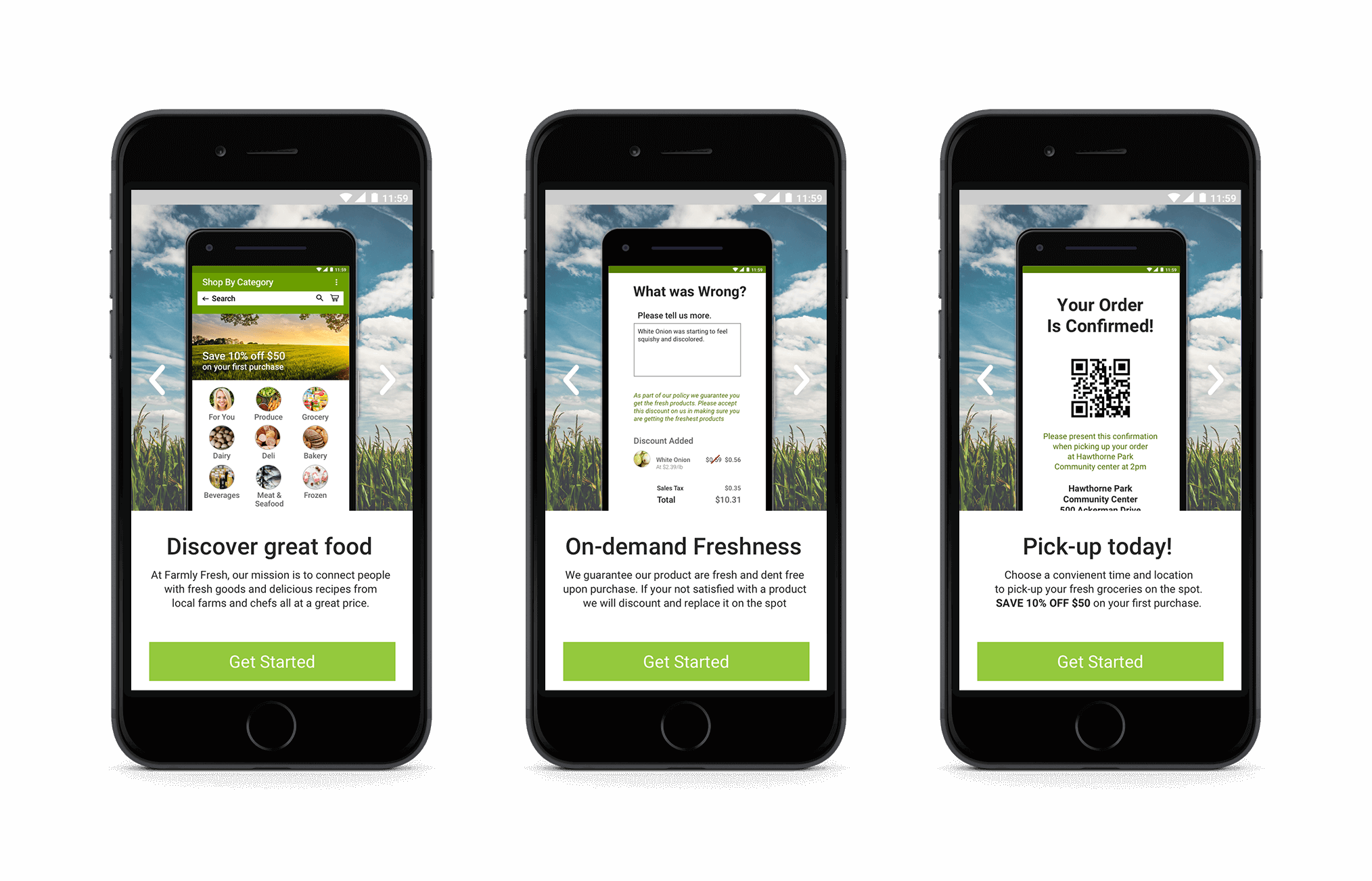
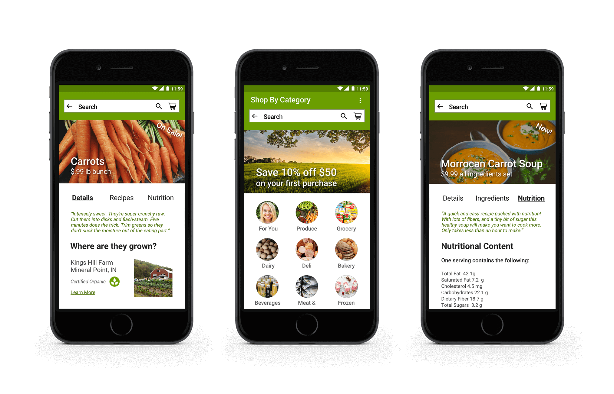
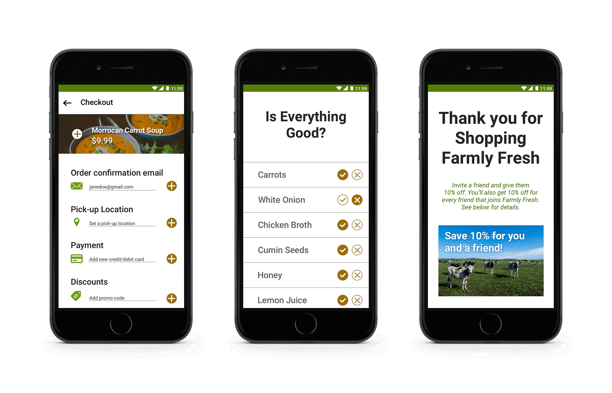
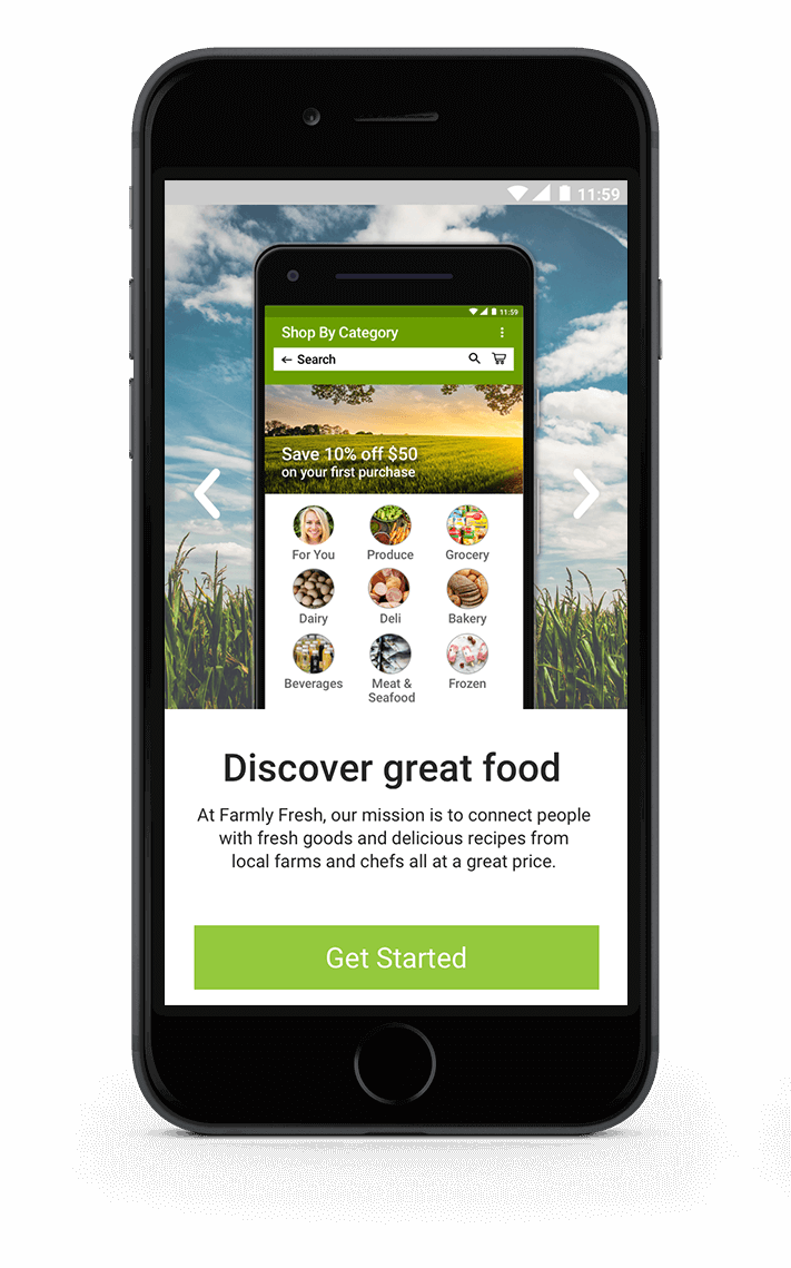
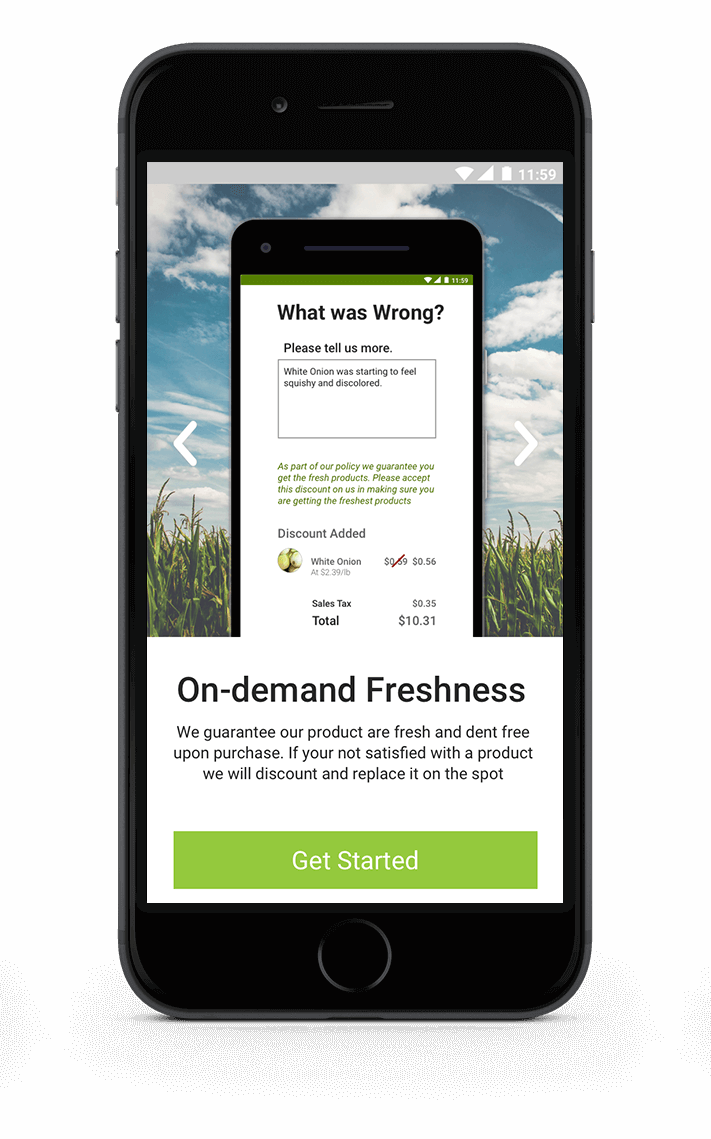
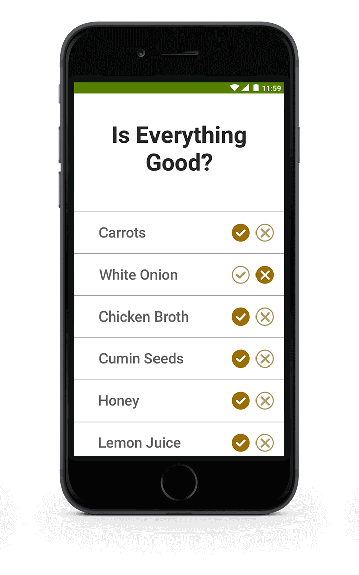
From my latest sketch iterations, I broke down more of the functions to show how users would receive produce discounts, based on the feedback given about the produce’s quality. The goal was to build trust with Farmly Fresh’s audience showing from start to finish they would receive only the best products available. The new home page would also provide stores a chance to promote deals, potential ads, and suggest products in line with the users’ previous purchases.
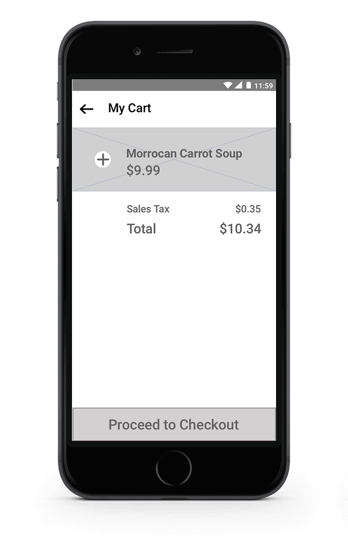
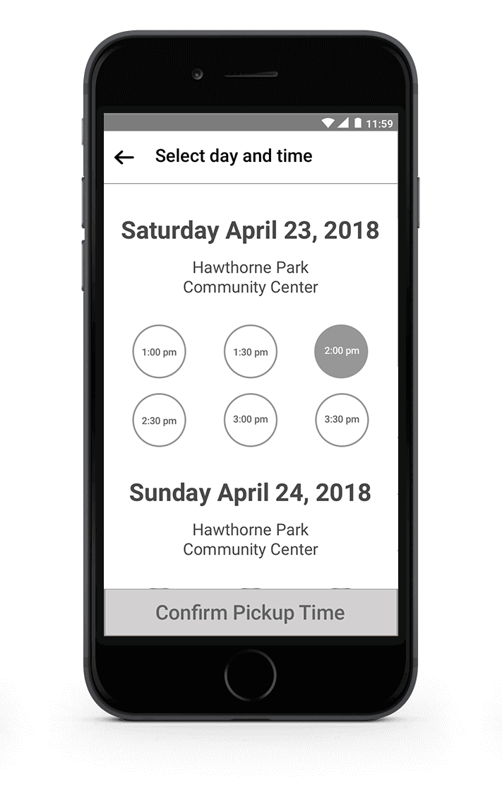
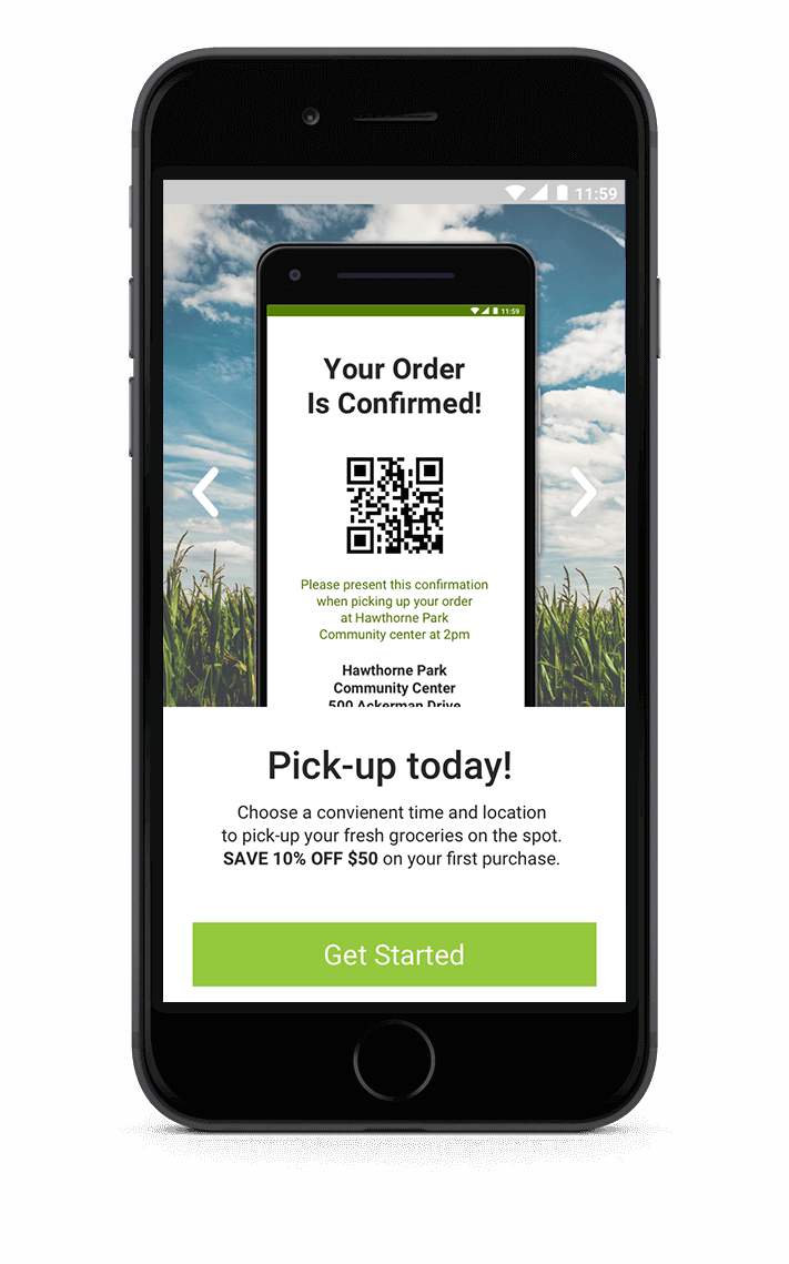
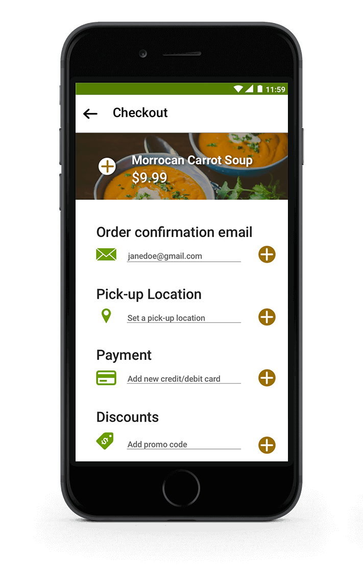
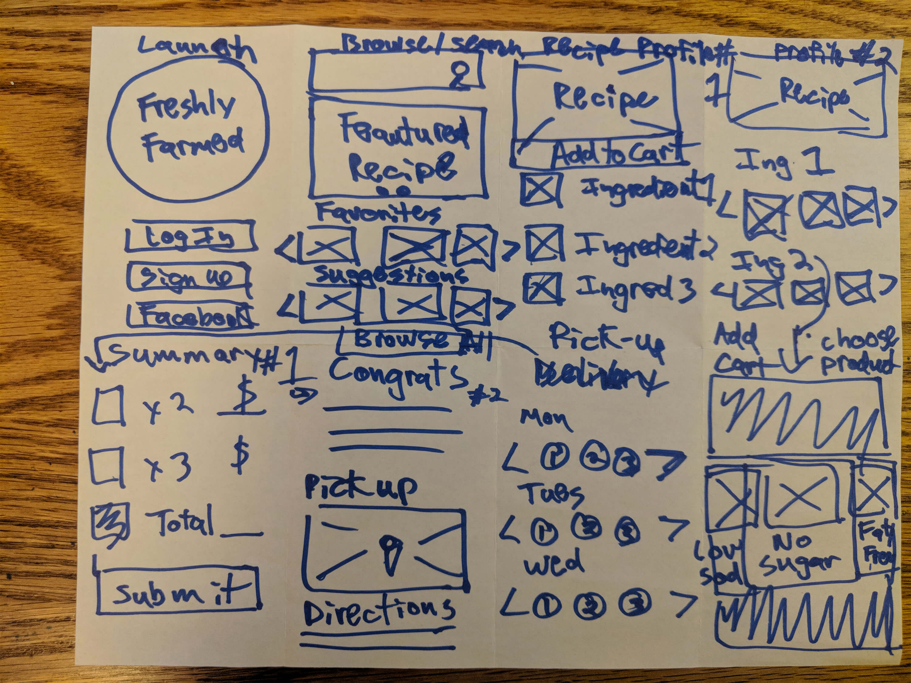
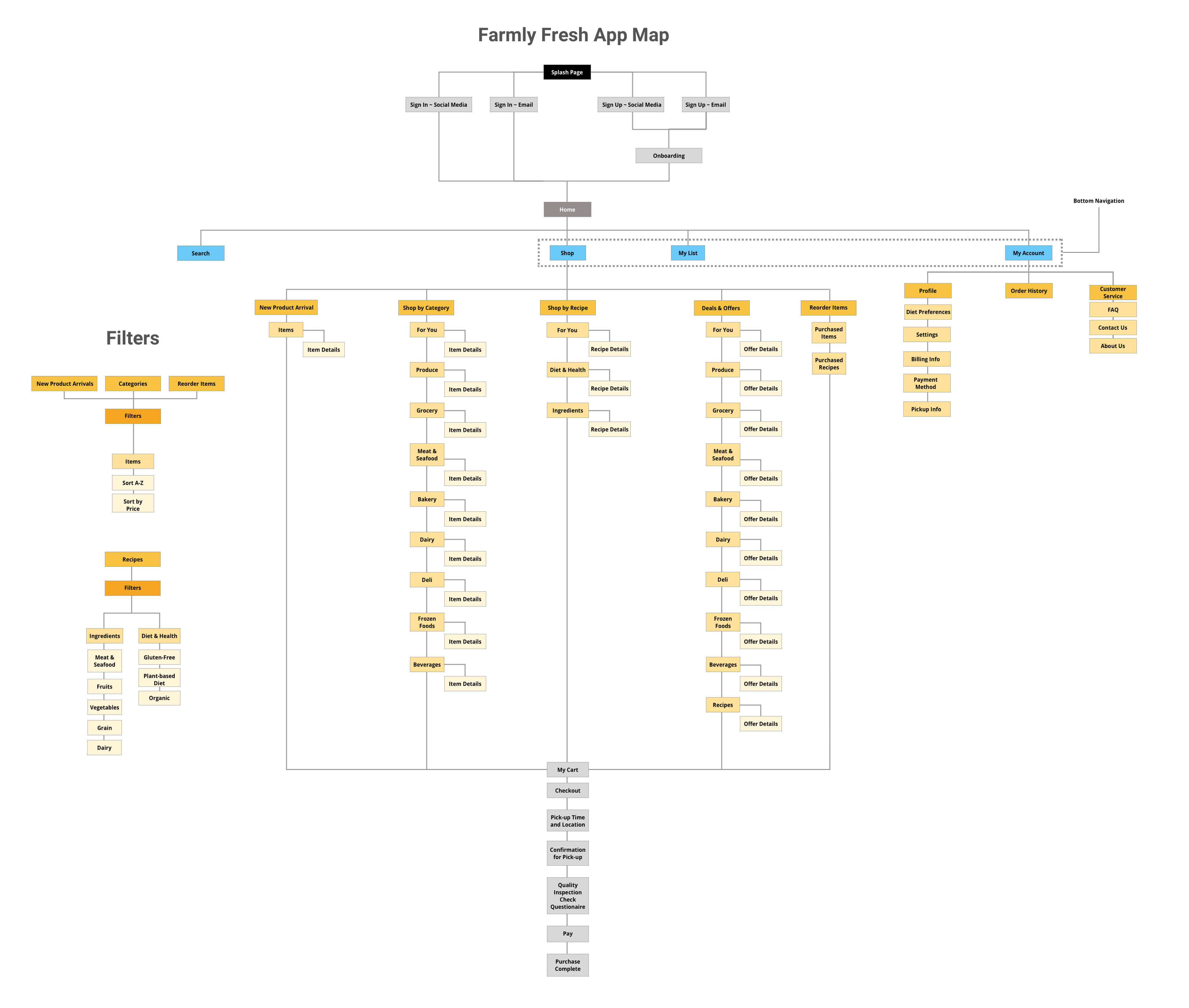
The app map below shows the step-by-step process users will take from selecting products to receiving their final purchase.
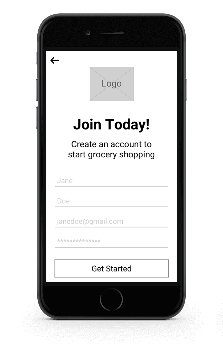
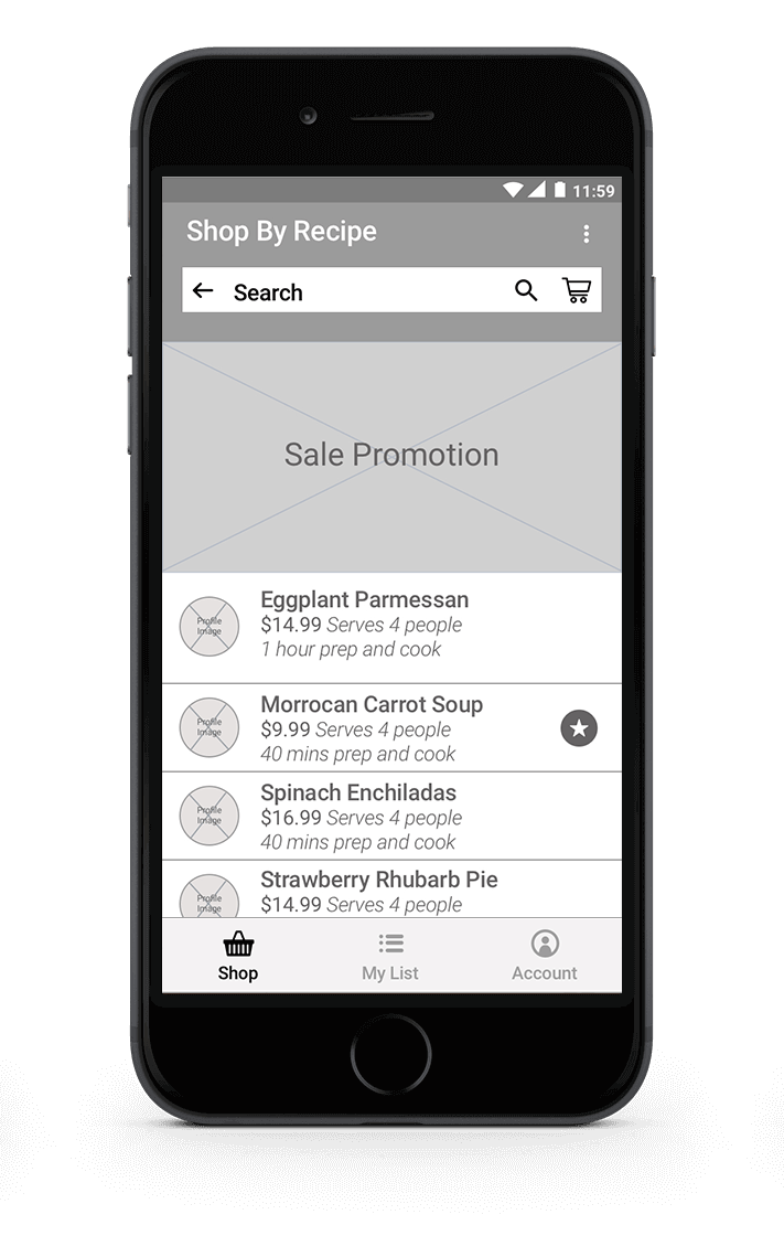
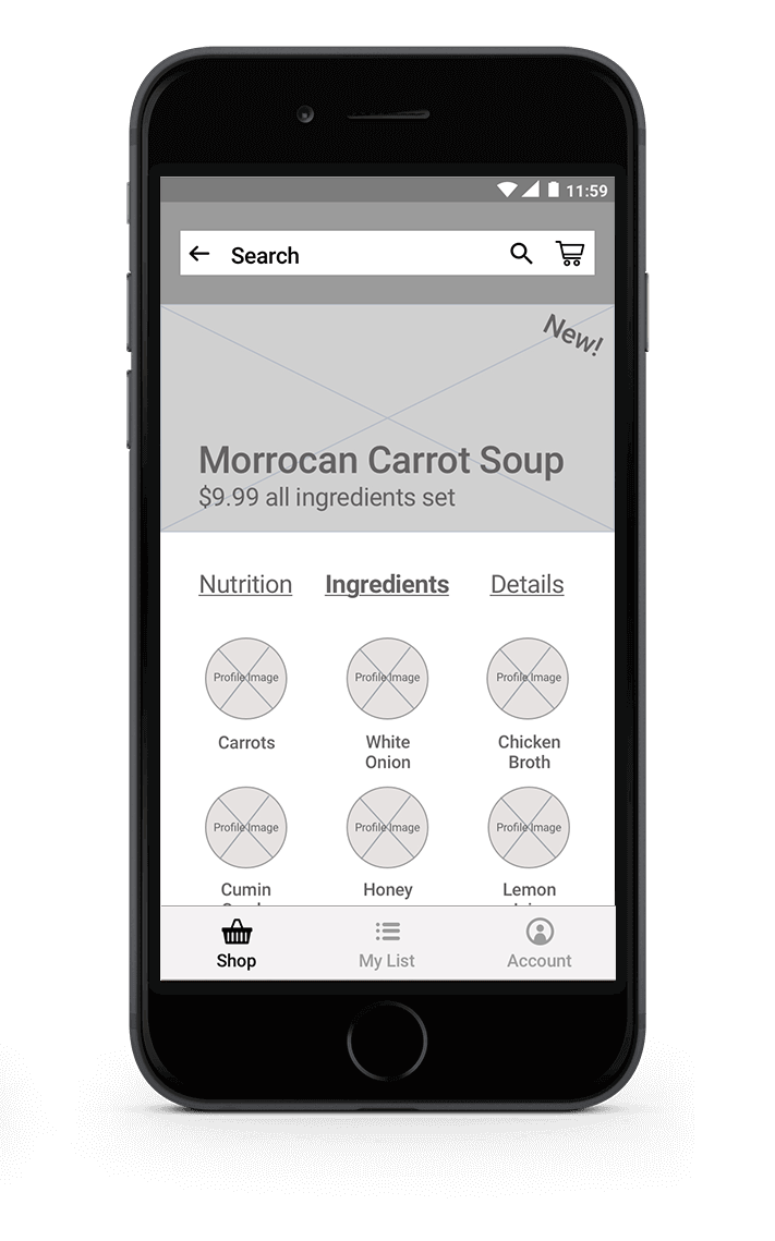
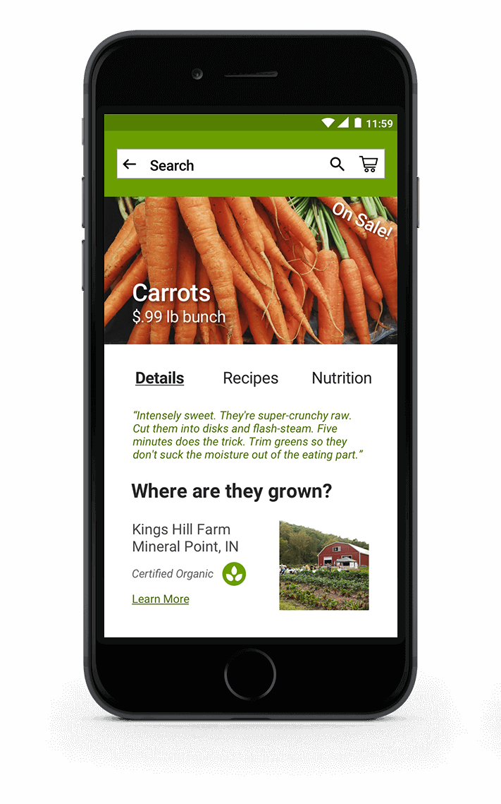
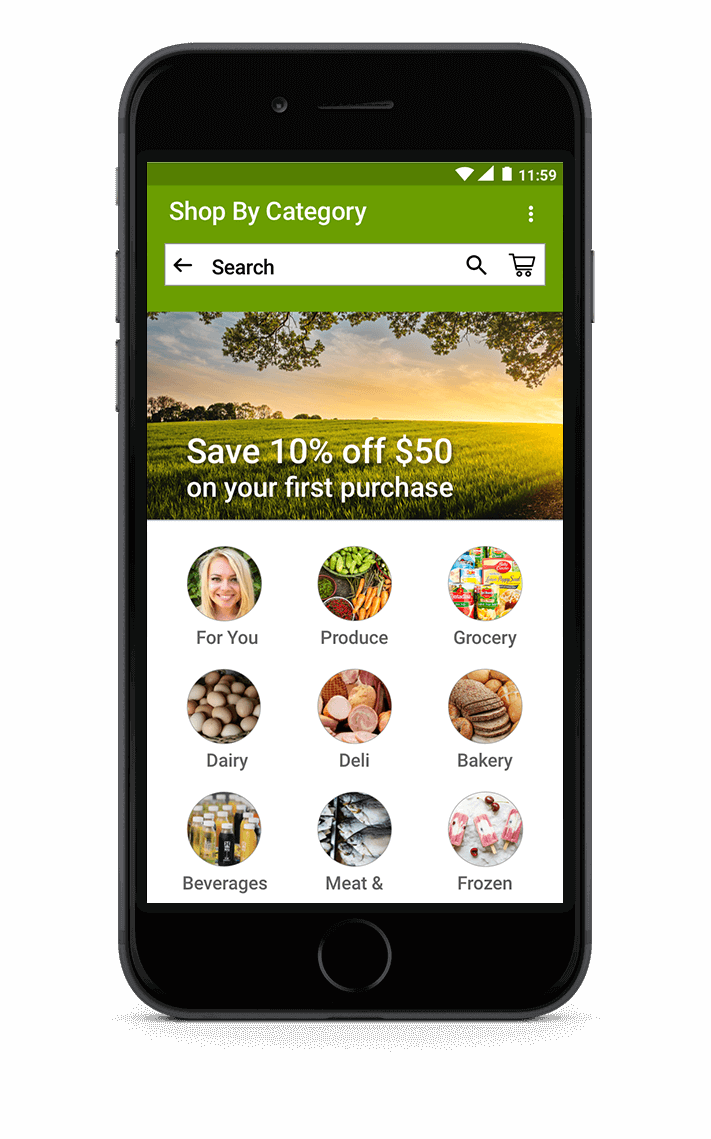
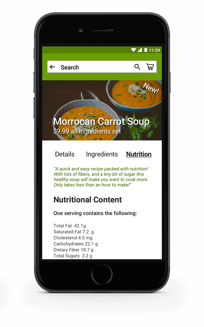
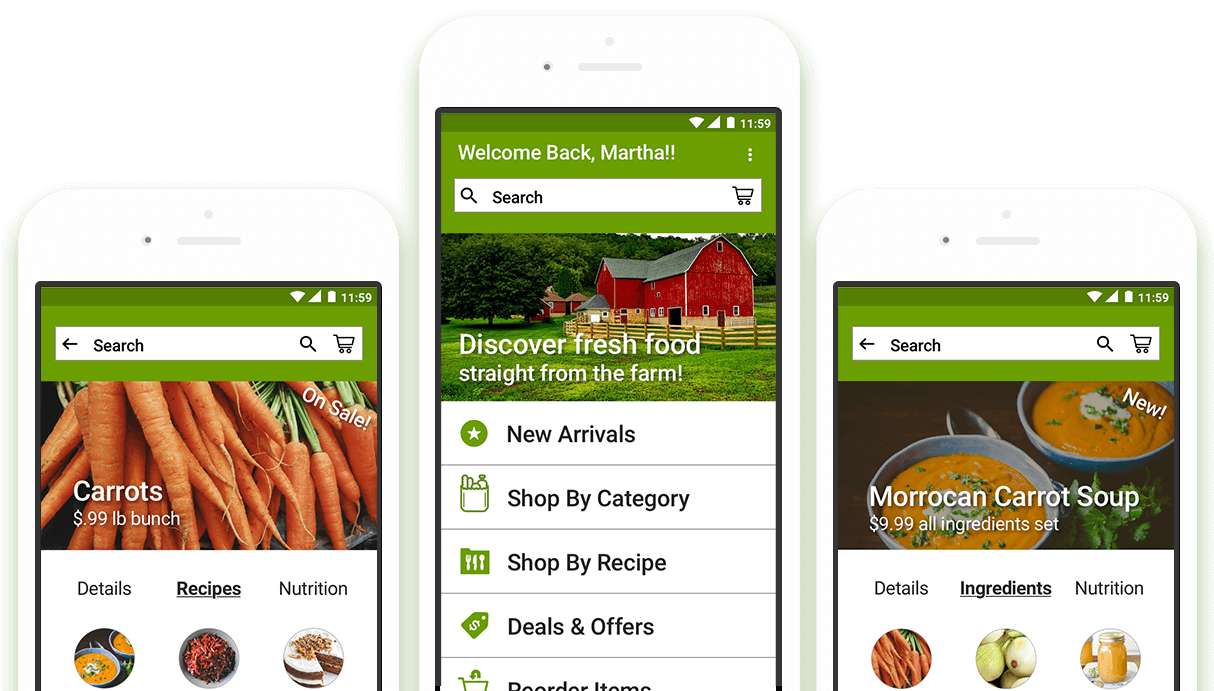
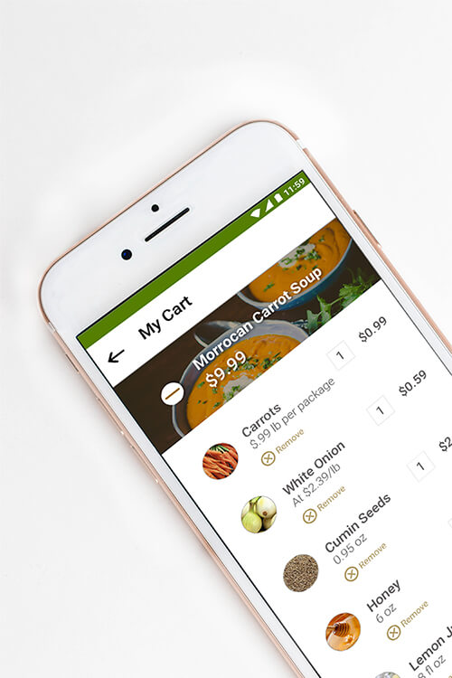
Utilizing the concept sketches and app map, I fleshed out my sketches into wireframes to show different interactions users can browse through to find information about what recipes can you make from carrots, what ingredients are needed for a recipe, and where does the produce originate from.
In the visual design phase, I wanted to explore different art directions from seeing food in a rural environment to shopping at an urban market.
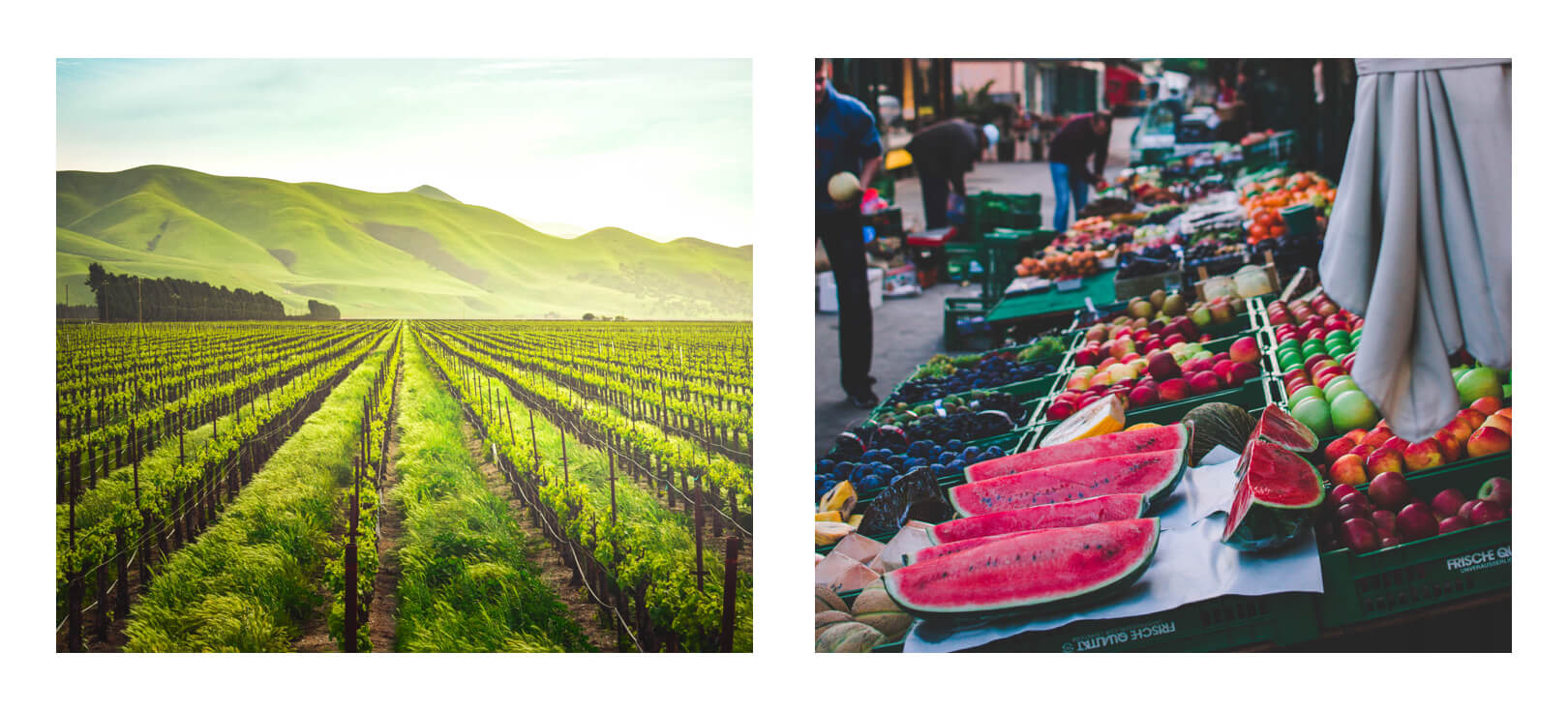
To start out, I created mood boards as inspiration to represent the urban and rural style I was looking to design.
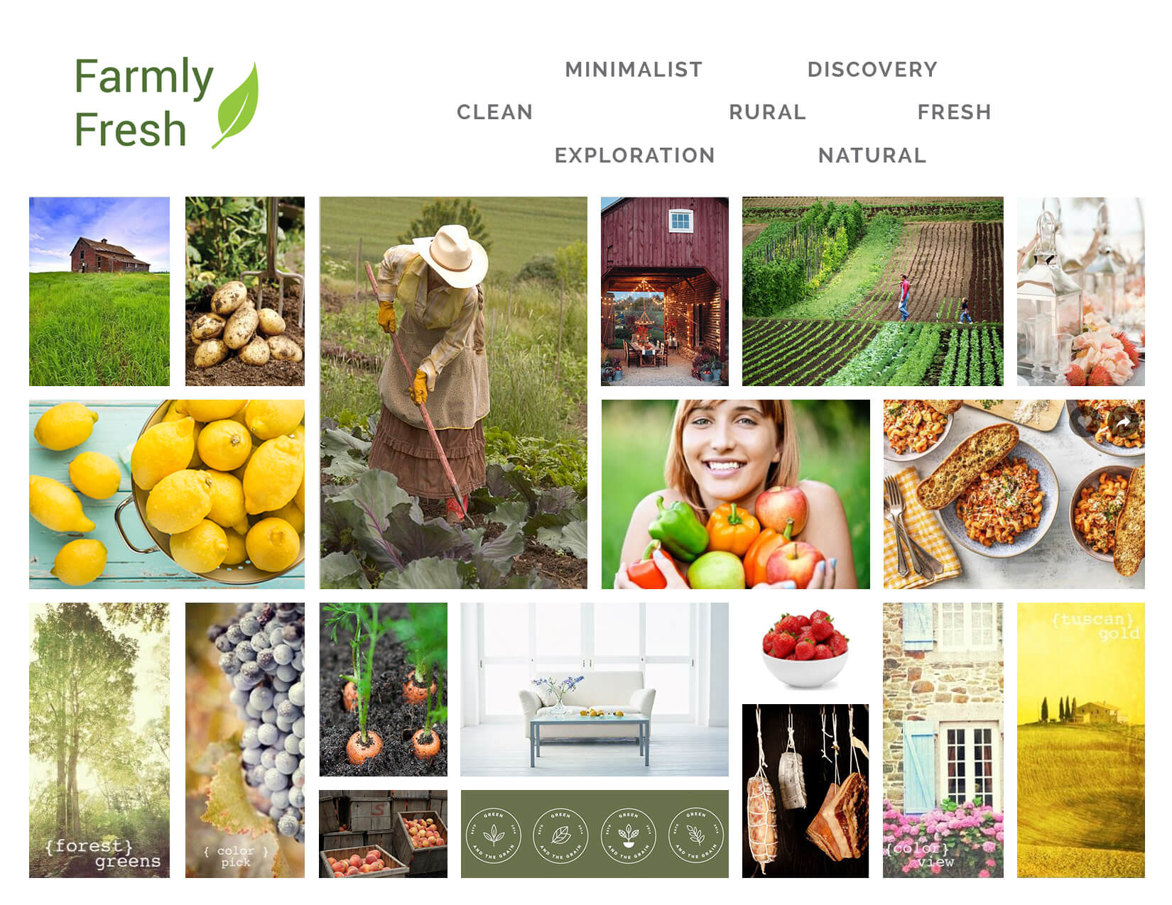
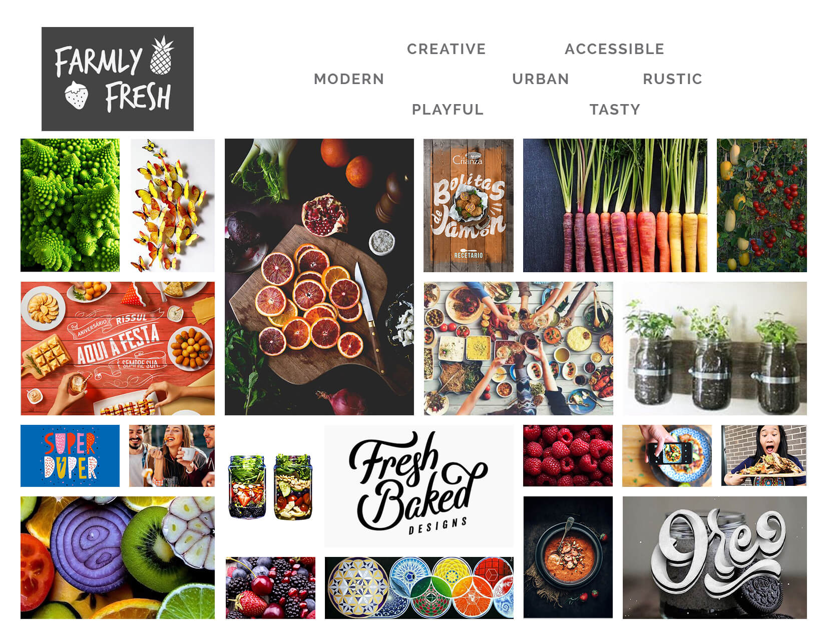
In designing the logo, I explored a variety of different logo ideas ranging from a “playful and vibrant” to “fresh and authentic” perspective. I took elements from a variety of images such as leaves, groceries and produce to convey Farmly Fresh’s brand.
The goal of each concept is to represent the brand’s dedication to discovering new products and providing fresh food to their customers.
Expanding from the mood boards and logo design, I designed two style tiles to represent the different aesthetics I was striving for. I experimented with different color palettes and typography to see what worked best for each style.
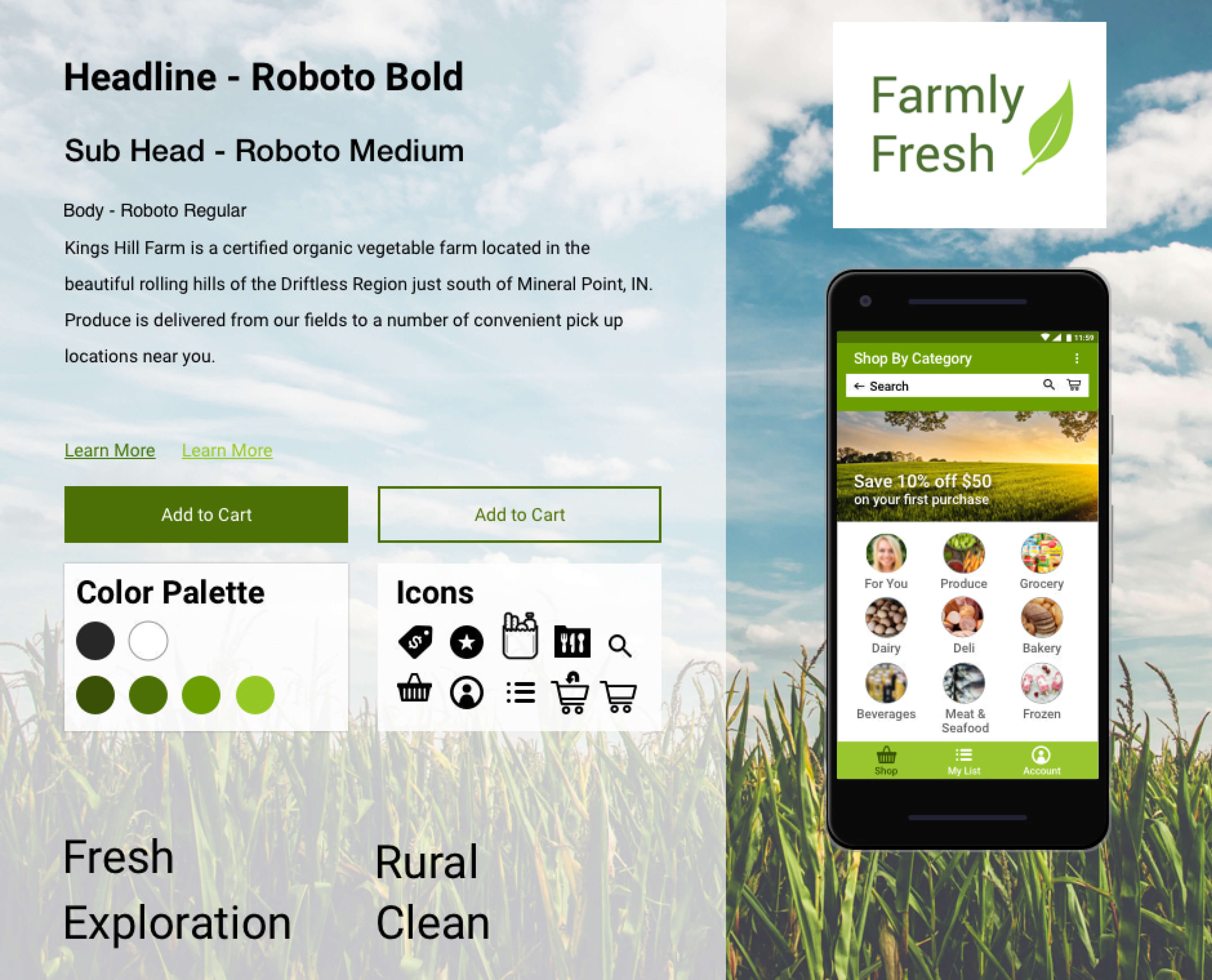
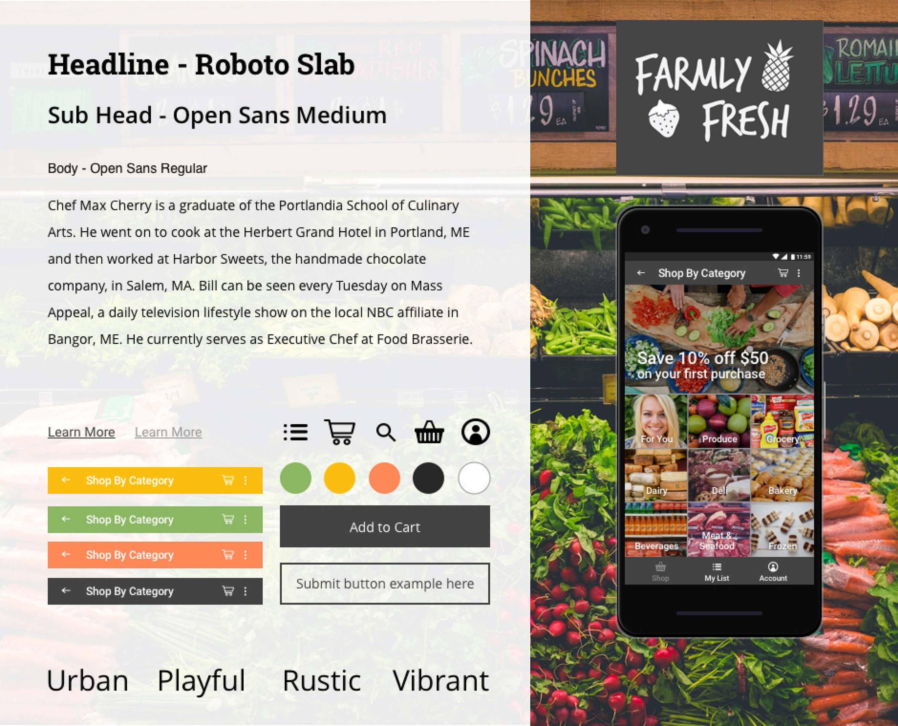
After solidifying the visual style, I started designing in detail the style for Farmly Fresh’s new app. I chose the rural style, because I thought best reflected what the users wanted, local and sustainable products fresh from the farm.
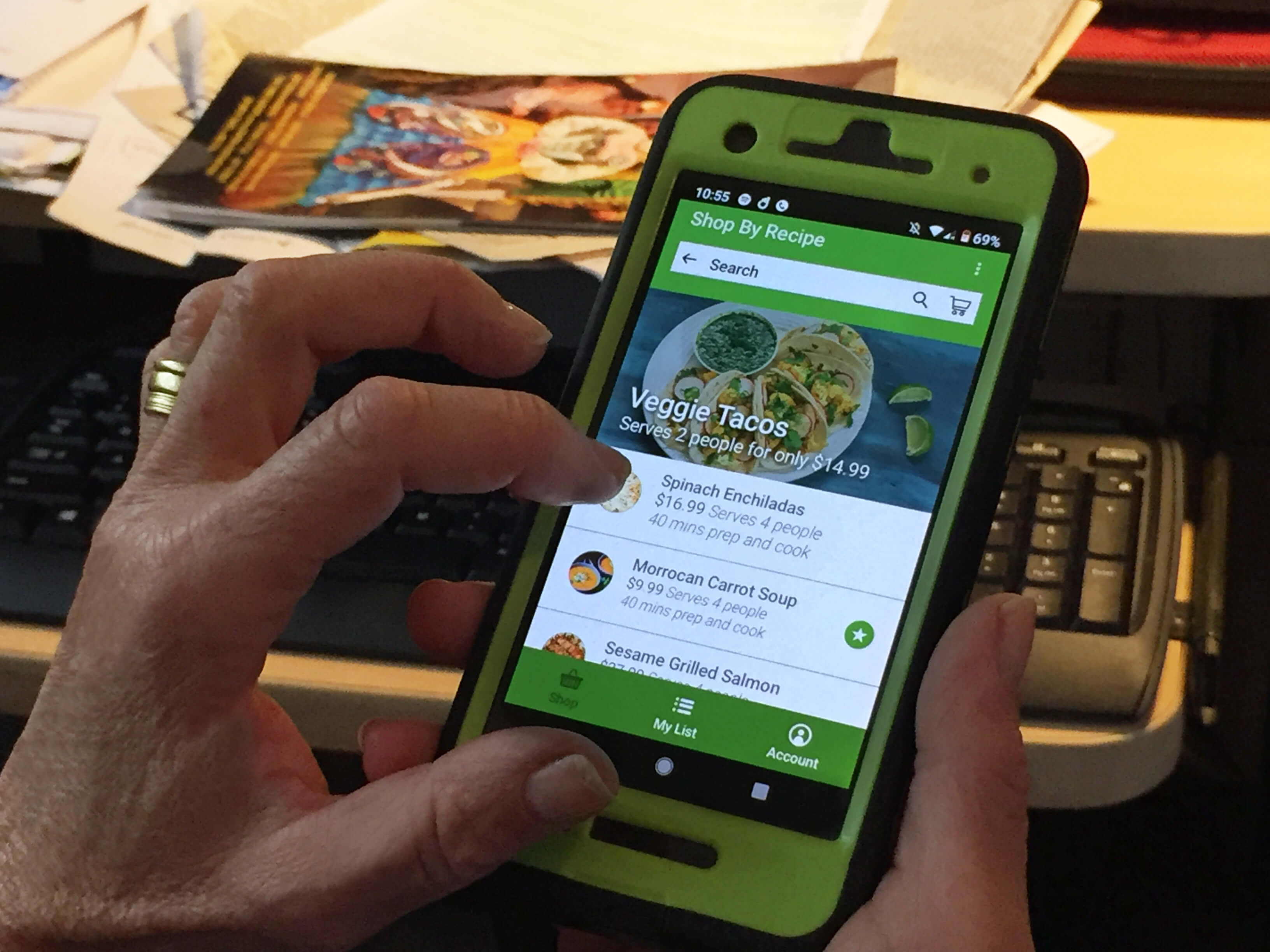
To evaluate Farmly Fresh, I conducted user testing with 3 users (age 24 -37), asking questions and giving them tasks related to usability and the app’s design. My goals with these testing were to understand if:
• Users knew what the value proposition of Farmly Fresh was.
• Usability of Farmly Fresh was intuitive for users.
• The visuals and branding fit the app aesthetics.
Overall, users understood the app’s value proposition of getting fresh food straight from local farms at a cheap price
• Users were satisfied with the general usability of the app, from discovering new products and recipes to completing an order.
• The app’s aesthetics appealed to users which they thought made the app feel local, fresh, and organic. by making the app feel local, fresh and organic.
• There was a consensus from users not understanding what the app’s main value proposition was and how it differentiated from other grocery app services. An onboarding section was added in the latest design iteration to give users an overview of what Farmly Fresh’s value proposition was.
• A name change was also recommended by users so this app would be easy to remember to know where to go back and shop.
This was the first project I took from start to finish in establishing my initial design process. Having a visual design background, I challenged myself to design the best app possible, while incorporating UX design in thinking about the user’s point of view.
Coming from a visual design background with no research, I learned how important user research is by getting user feedback instead of designing for yourself.
In designing this app, my passion for food and produce grew by understanding how it affects people’s lives. My hope is to develop this app further by connecting consumers, farmers, and chefs together to create an experience that brings quality produces and recipes to users.


Copyright 2018 © Roland So. All Rights Reserved.