Blue is my Color

Web Design, Front-End Development

Overview

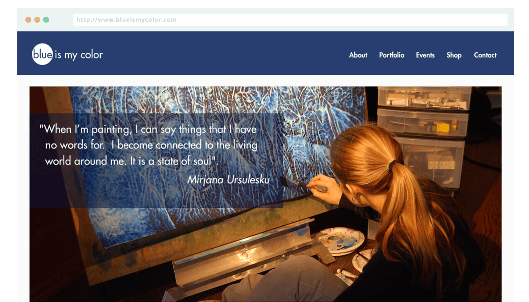
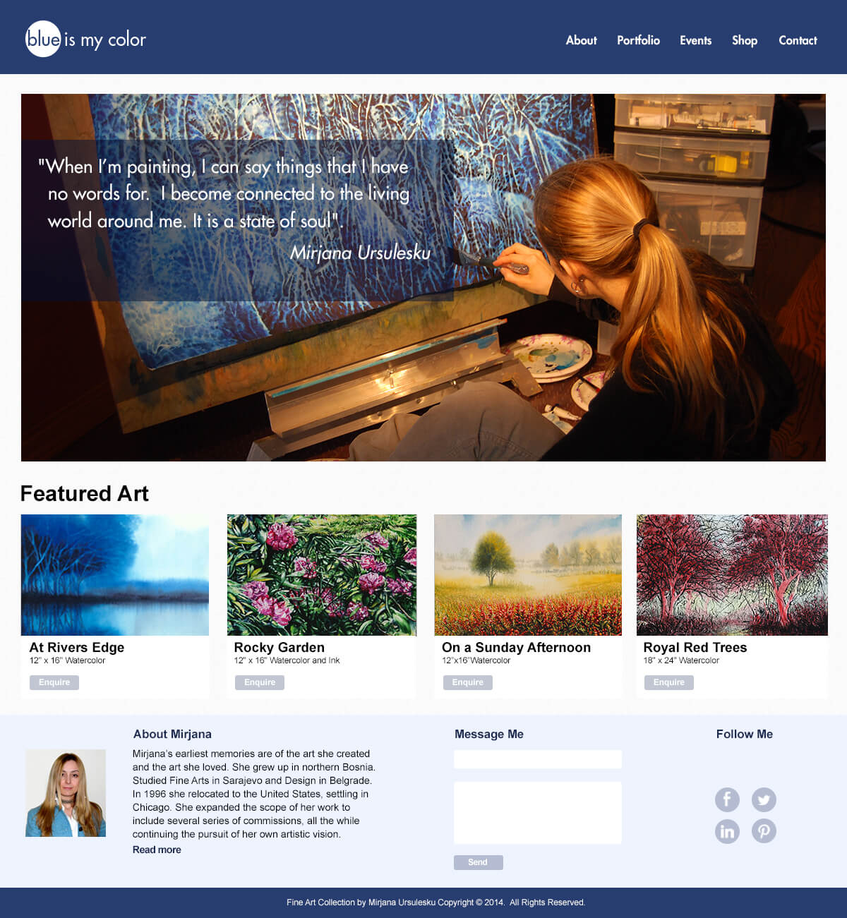
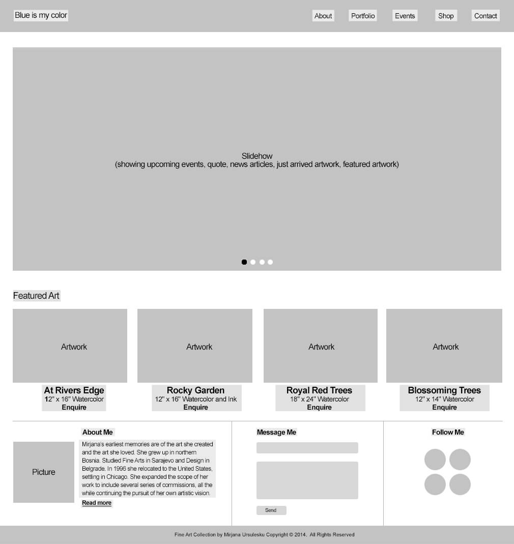
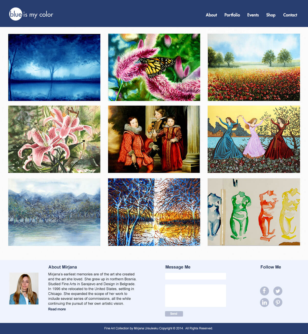
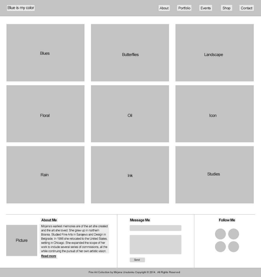
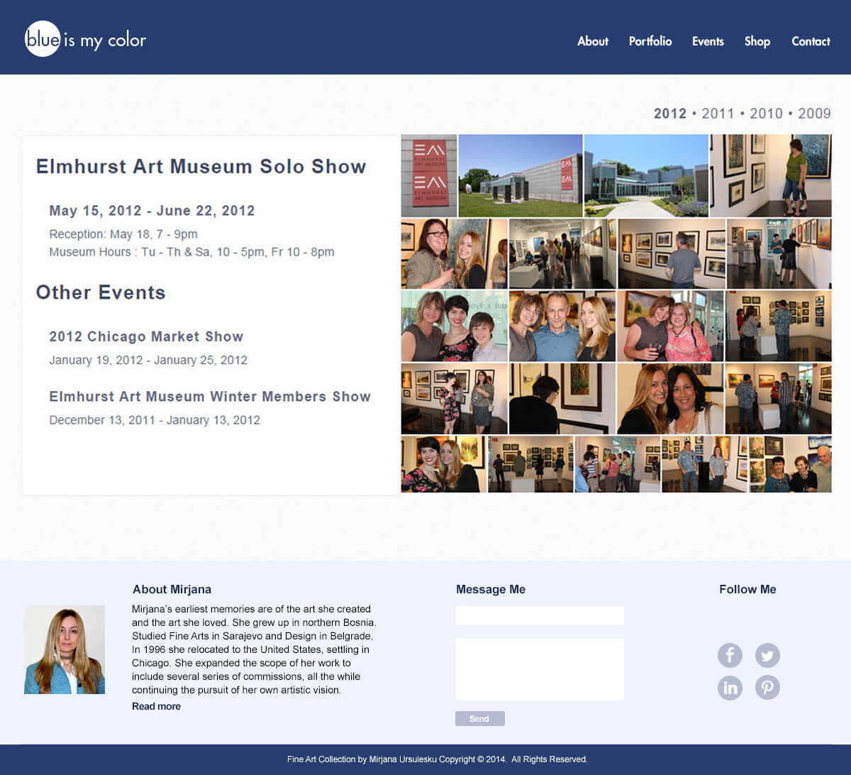
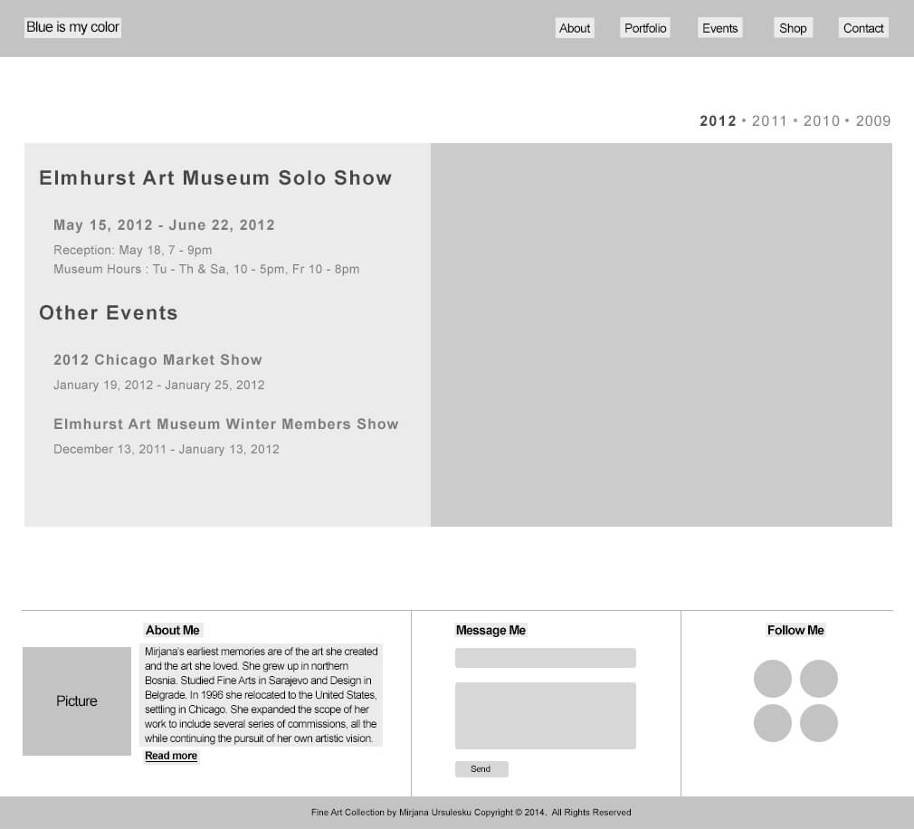
Blue is my Color is Mirjana Ursulesku’s portfolio website showcasing her commissioned fine art that is tailored to fit any business or personal settings.

View Hi-Fidelity Prototype

The Challenge

Mirjana Ursulesku is a painter and graphic designer living in the Chicagoland area. She came to me looking for advice to restructure and rebrand her portfolio website. My task was to redesign her website, create a new identity, and color scheme that reflected her artwork.

sketch

Painting a New Brand

For her new identity, I explored a variety of concepts that were clean and simple to coincide with Mirjana’s redesigned website. I conceptualized her new logo off a blue swatch that coincides with the site’s name and featured artwork.

Spotlighting the Artist

On the home page, I wanted to make Mirjana’s portfolio, events, and quotes easily accessible through a scrolling slideshow. Below the slideshow, I designed a section were she could showcase her featured artwork, along with inquire links for easy users access to find out about the availability of a specific artwork. In addition, users can also read Mirjana’s bio, send a message, or preview her upcoming through her social media channels.

Click arrows to view mockups and wireframes.

Promoting the Art

For the portfolio page, I decided to break it down into 9 categories. Within each category, users can a choose and view a painting in a larger lightbox. When in the light box, users have access to cycle through each painting galleries. If interested, users can click the enquire button to send a message for an estimated price of the artwork.

Click arrows to view mockups and wireframes.

Organizing the Events

For the events page, I wanted to restructure the content so each event was organized chronologically by year and date for easy user accessibility. When clicked on, each event has a description to the left with corresponding thumbnail photos to the right.

Click arrows to view mockups and wireframes.